Brand design of a healthcare tech startup

Background & Challenge:
Who is RingMD? RingMD is a healthcare tech startup that helps to connect patients with the best doctors or wellness experts around the world. How do we rethink, enhance and refresh the experience of a patient consulting a doctor or a wellness expert? How do we create a visual language that is more approachable, empathetic, and trustworthy?
These were some of the questions which were troubling me when I joined RingMD as a head of design (and then took over the product as well later). I could clearly see the evolution of the brand and product design RingMD could be. The ultimate goal of this evolution was to create a product that mattered to millions. I divided this journey into two parts; the first part was to revamp the brand and create a visual framework, the second part was to redesign the product from scratch (which I’ve explained here).
Internal audit & analysis:
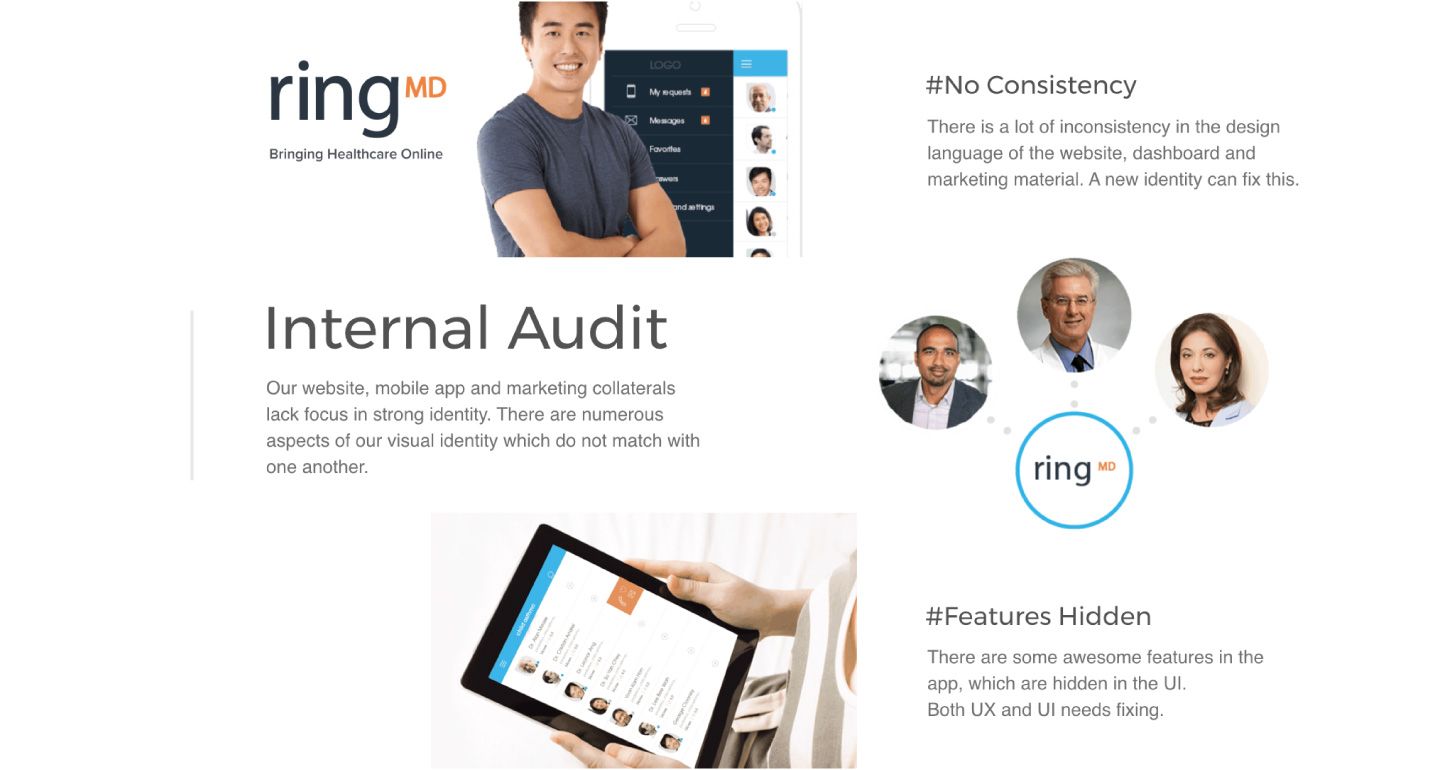
Rebranding started with a heavy internal audit of the brand. Which typically tells us where we are and where the industry is from design and brand perspective. I’ve collected design samples of all the collaterals we’ve created till that point of time. The result was a giant mirror in the face, showing us the inconsistency, incoherent, and weak identity.
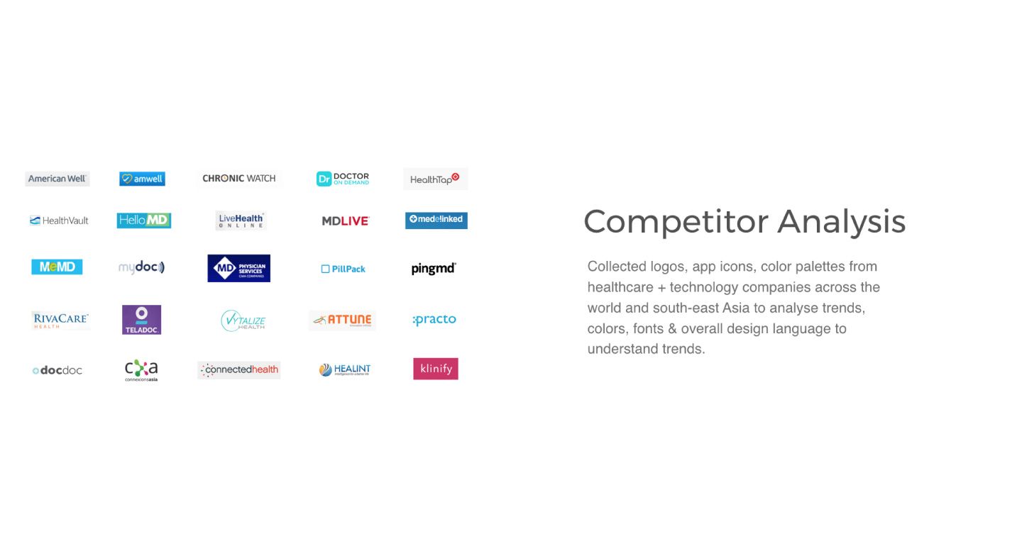
To understand the industry benchmark, I’ve collected logos from all the competitors in the landscape and around the globe. The next step was to do an introspection and understand who we are? what do we stand for? and who we build our product for? This exercise helps in a deep existential understanding and resulted in design personas, objective, and subjective goals for the brand and for the company.
Brand design process
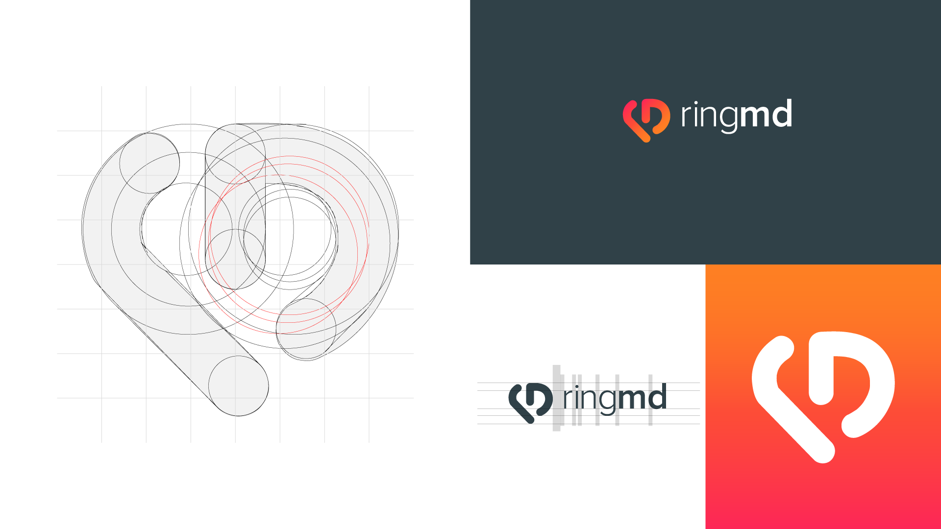
Equipped with a freshly defined objective, subjective goals, and personas, I created the design roadmap, the timelines, deliverables, next steps, and milestones. Once the documentation work is done, I set out on a quest for the holy grail, the holy grail of a perfect monogram. The shape of the logo has a powerful impact on consumers. Enterprises across the world have spent millions of dollars on designing a corporate logo for a good reason.
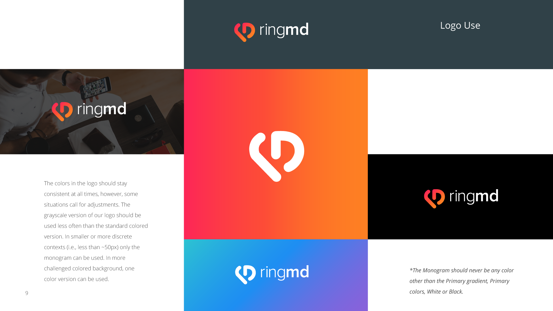
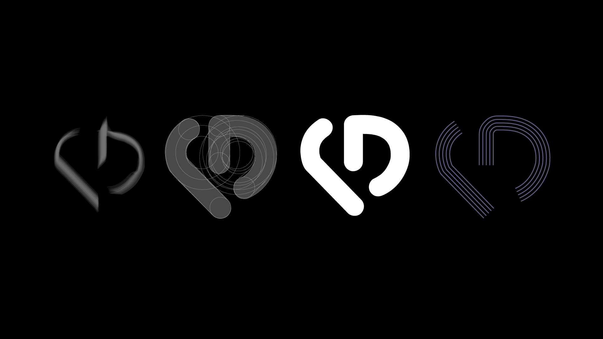
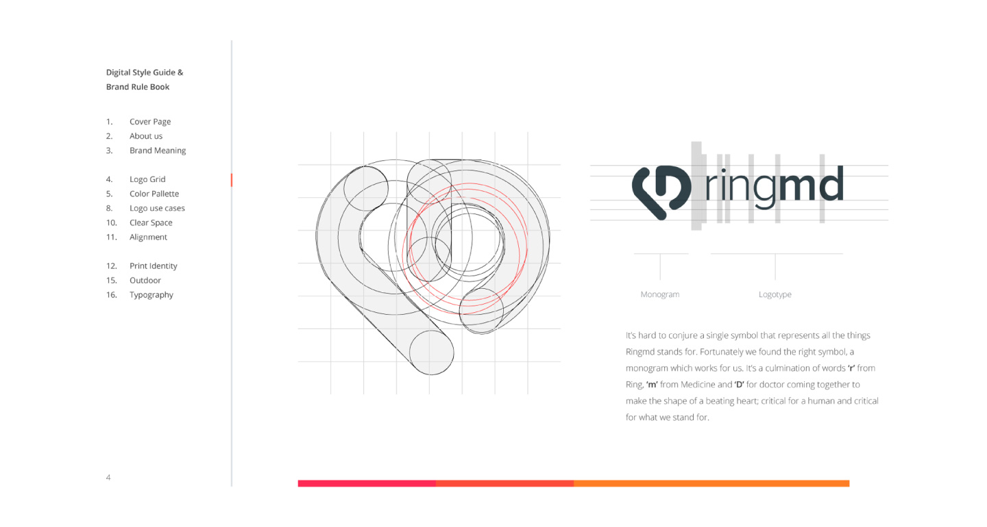
To me, finding the right glyph or monogram that can define and represent a brand is like finding the holy grail. I sketch. Sketch and sketch to find the perfect shape and in the case of RingMD, I found it. I created a glyph combining ‘r’, ‘m’ and ‘D’ of RingMD to make a heart. The nexus of these three letters forming a 'heart' felt right! I rounded the shape to make it more approachable and warm.
Step-by-step details of the process
- Understand the market & competitors:
Branding is one of the most important determinants of consumer choices. To start off, it is important to understand the industry, the competitors, and more importantly the users, customers, their behaviors, current and future trends. - Define the vision & boundaries:
The psychological mechanisms of how branding influences decision making is an interesting subject. It was important to understand the psychological effects of the brand on consumer behavior. This led me to define a more accurate objective and subjective goals for the brand. - Find the monogram:
There are numerous studies that talk about a strong brand logo and subjective preferences are integrated and intertwined in the consumer decision-making process, thereby altering choice behavior. The reason why a strong monogram, companies like Nike and Apple got this right. - Set the design language:
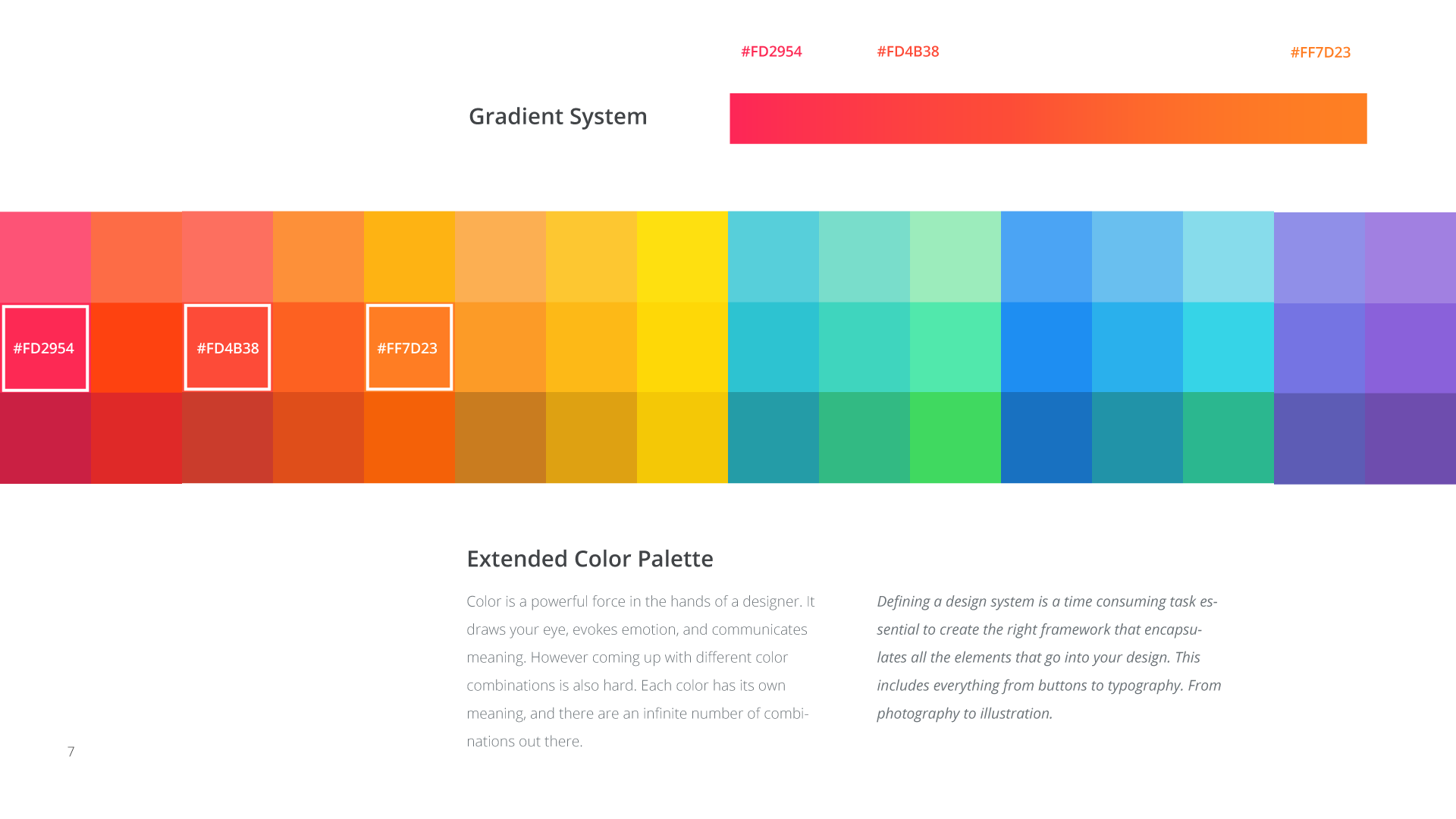
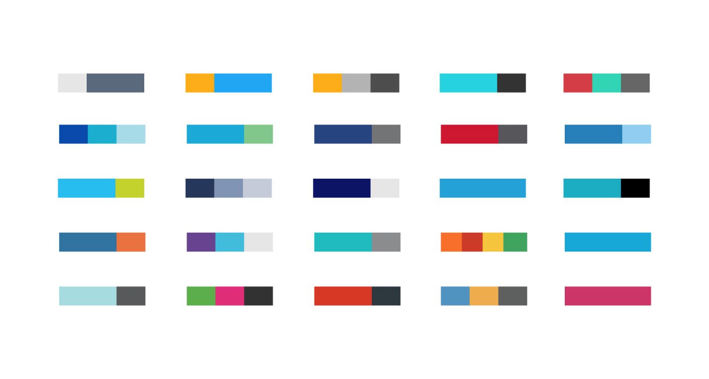
Once the monogram is decided, the rest of the design language falls into place. Deciding on a strong brand color palette and mixing it up with the elements from the monogram forms a strong platform for the design language.
The final result:
After locking in the shape, the typeface needed focus, I picked the right weights to complement the nest. Once the spacing was perfected, I moved to find the right color palette to add warmness to the logo, making it more approachable.

Brand guidelines:
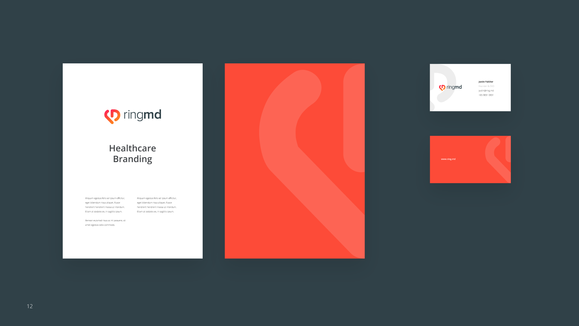
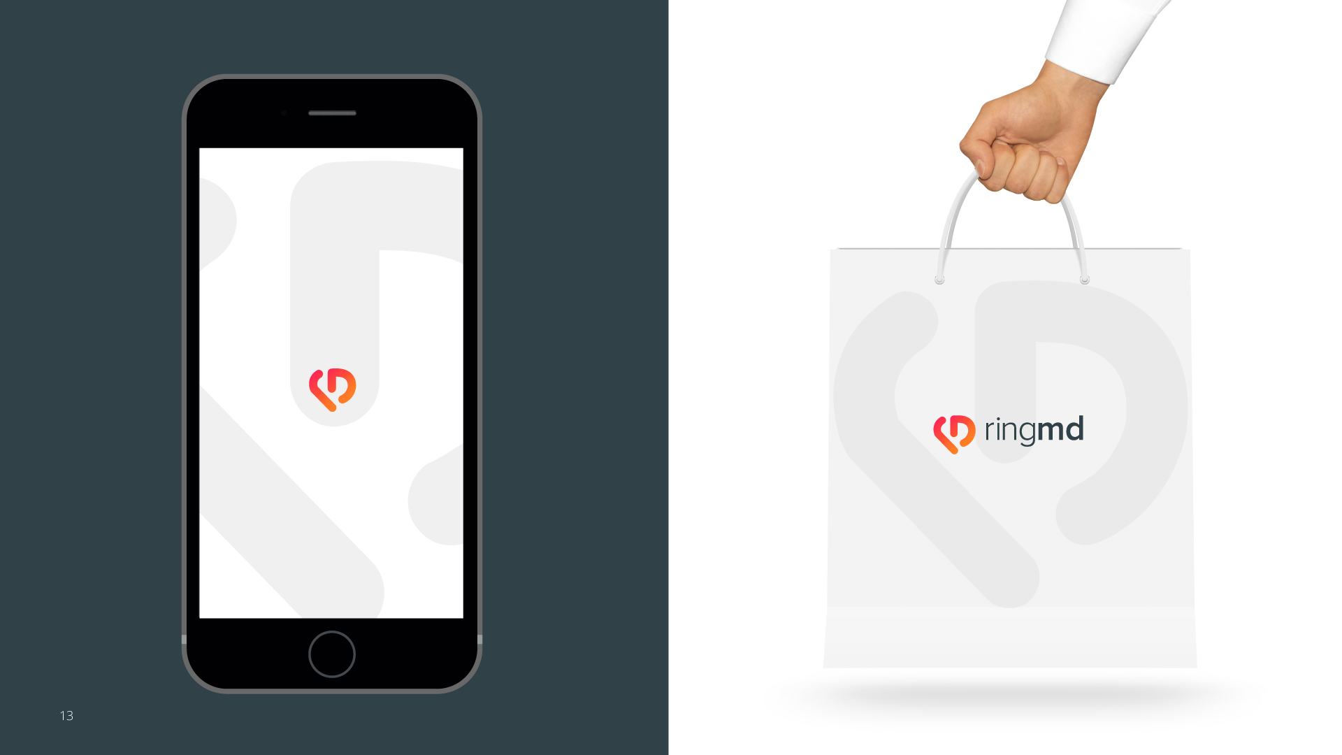
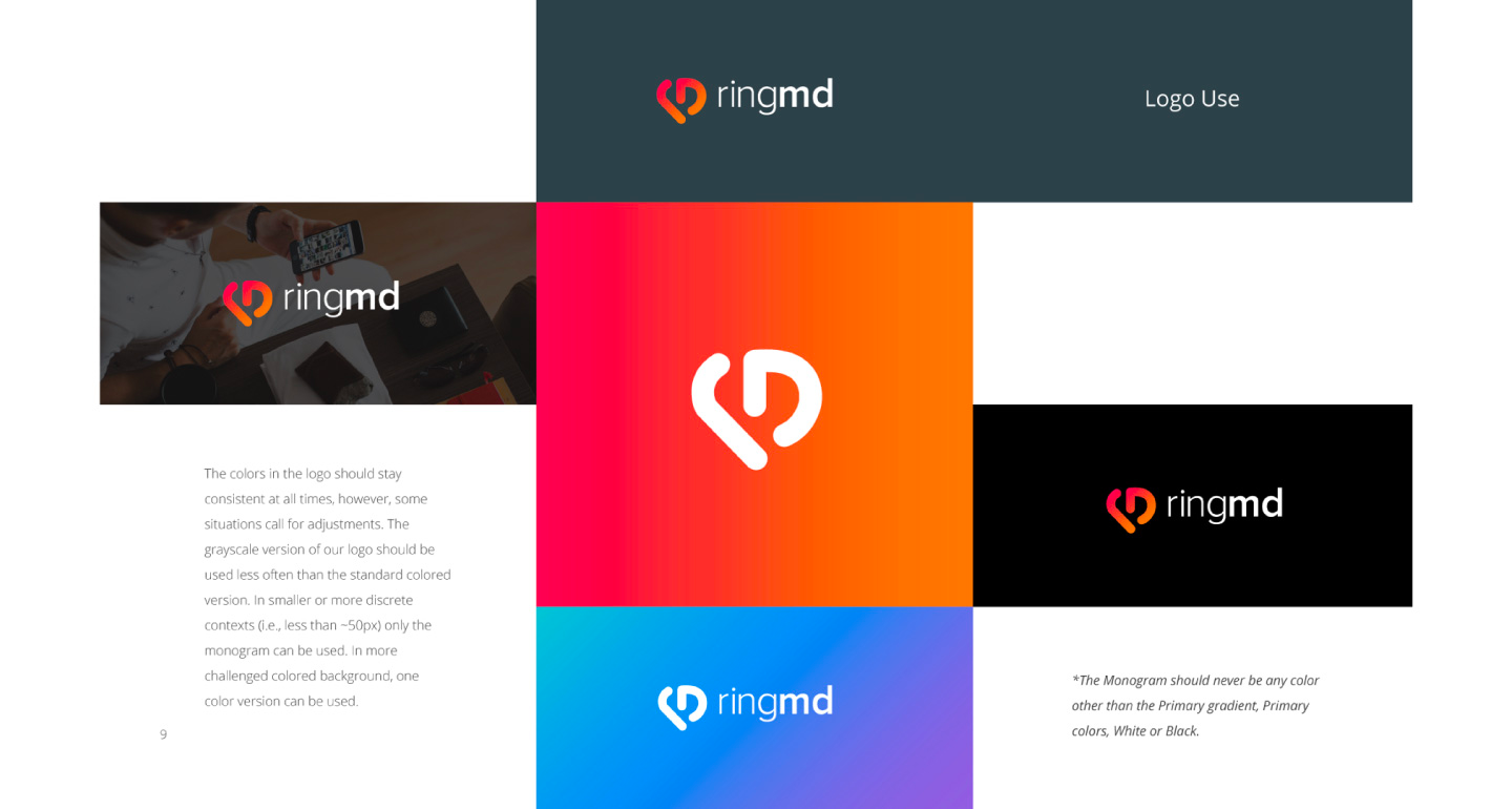
Once the logo is locked and done, the rest of the design elements will roll out quicker. The extended color palette (keeping in mind for the wearable we will be launching soon), typography, illustration styles, iconography, emailers, company schwag, and other marketing collaterals.